In the summer of 2010, after my first year of graduate school, I was in Basel, Switzerland to participate in the Visual Communication Institute/The Basel School of Design summer program. At the same time the World Cup was happening in South Africa. Basel is the cleanest, quietest, most orderly place I have ever spent time in. There was a certain “buzz” in the background as you walked around town. Since Basel had the traditional European air conditioning (a fan and a window), you could hear the distinct sound of the African vuvuzela coming from peoples windows as you walked by, with the Word Cup games playing on the television. Everything else was completely quiet, with the exception of the sounds of an ecstatic eruption that you could hear from the Brazilian cafe 3 blocks away after a Brazil goal. While I was participating in the design workshops, I met some really talented designers including Safak Korkut, Indre Gru, Pablo Berger, Ben Kuyper, Pouya Ahmadi, Matthew Terdich, Terrence Knoles, Lorenzo Mueller, Gregory Vines, Brendan Weaver, Lisa Maione, Calina Prudente, and Nicole DeBrocky-Fusfeld to name a few. One of the workshops concentrated on poster design, an art perfected in Switzerland and still used as a powerful means of communication outside of the United States (that could be its own blog post). The workshop was run by Leander Eisenmann, a faculty member at the school. For inspiration, Leander took the group to the Basel Poster Archive featuring the masters of design and shared some of his own collection.


His approach was very straight forward. Here are some concepts to choose from, stay away from the computer and go out there and make a poster.
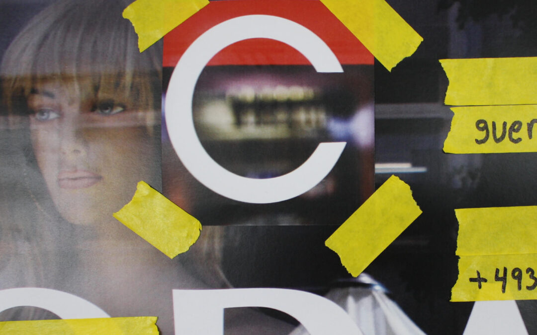
Considering the July weather, European air conditioning, and the heat from the 20 macs in the 5th floor computer lab, going outside was a welcome suggestion. The content that I chose was for a Comme Des Garçons (CDG*) Guerilla Store to take place in someone’s backyard in Berlin.
My concept was to create the poster using “borrowed” typography from other stores, since the CDG* store would be borrowing someone’s yard for a store. I set out with my DSLR to find typography throughout Basel. I specifically sought to find the letters C, D, G and a very elusive *. It turned into more of an exploration of the city itself, and what design looked like there in 2010. Neither is what I expected.


There was plenty to work with graphically, I settled on these 3 letters. The quest for an asterisk was going to have to be rethought.


Prior to the workshop, the school had sent us a supply list to bring. Many standard design tools, xactos, sharpies etc. Others more unusual, like different colors of tape, one roll of which I had was yellow. I decided to use the “MODA” image as my background, covered the MO&A with some tape, then I taped the found C and G onto the background image. I later made an asterisk out of tape to solve that problem. The secondary typography posed a challenge, what would work with these 3 different letterforms? My first instinct was to go startup the computer and set some san serif type, we are in Switzerland after all and that’s what you use here right. Leander suggested that I hand draw the secondary type instead. This seemed crazy to me, to be in the Basel School of Design, the legendary typography school, and I would be using my own half legible at best handwriting for type? I tried his idea, tried to write carefully, using different width sharpies to create hierarchy. After I finished, I took my hand taped, handwritten poster, put it on the wall and photographed it. I photographed it as opposed to scanning, to keep the natural depth created by the tape. After some color correction of the photograph the poster was finished.


By Daniel McManus