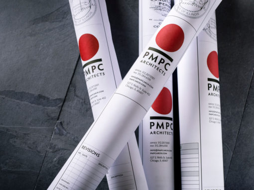
PMPC Architects
PMPC is a Chicago-based architecture firm that partnered with The Narrative to refresh it’s brand.
client
PMPC Architects
services
Brand Research
Brand Identity Refresh
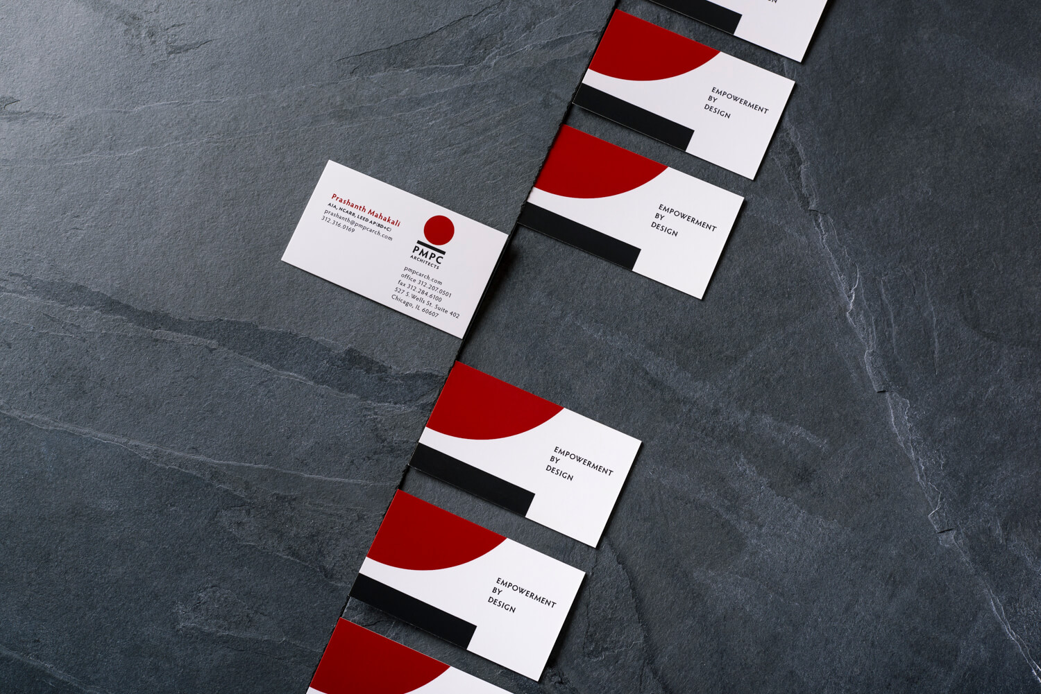
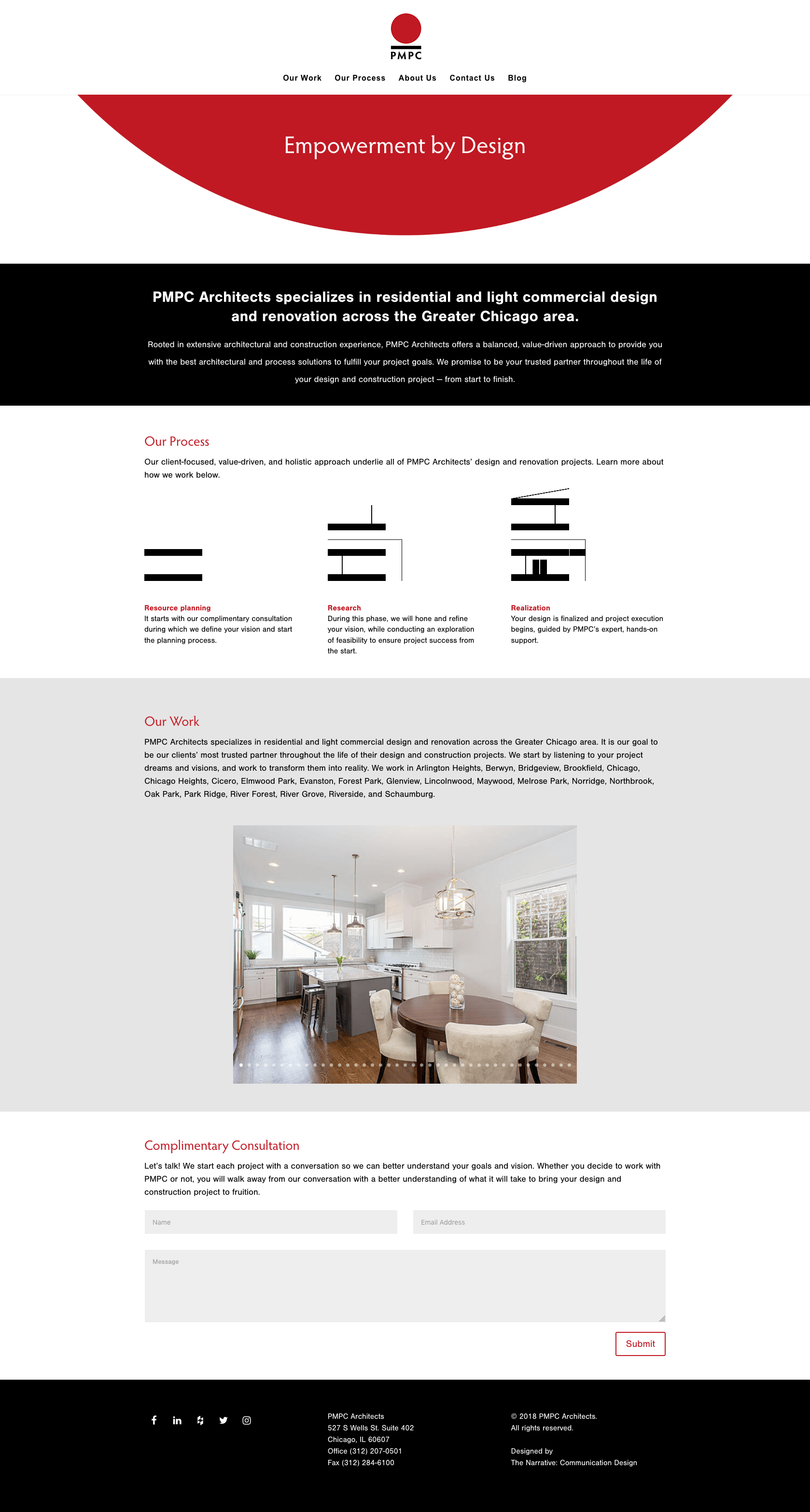
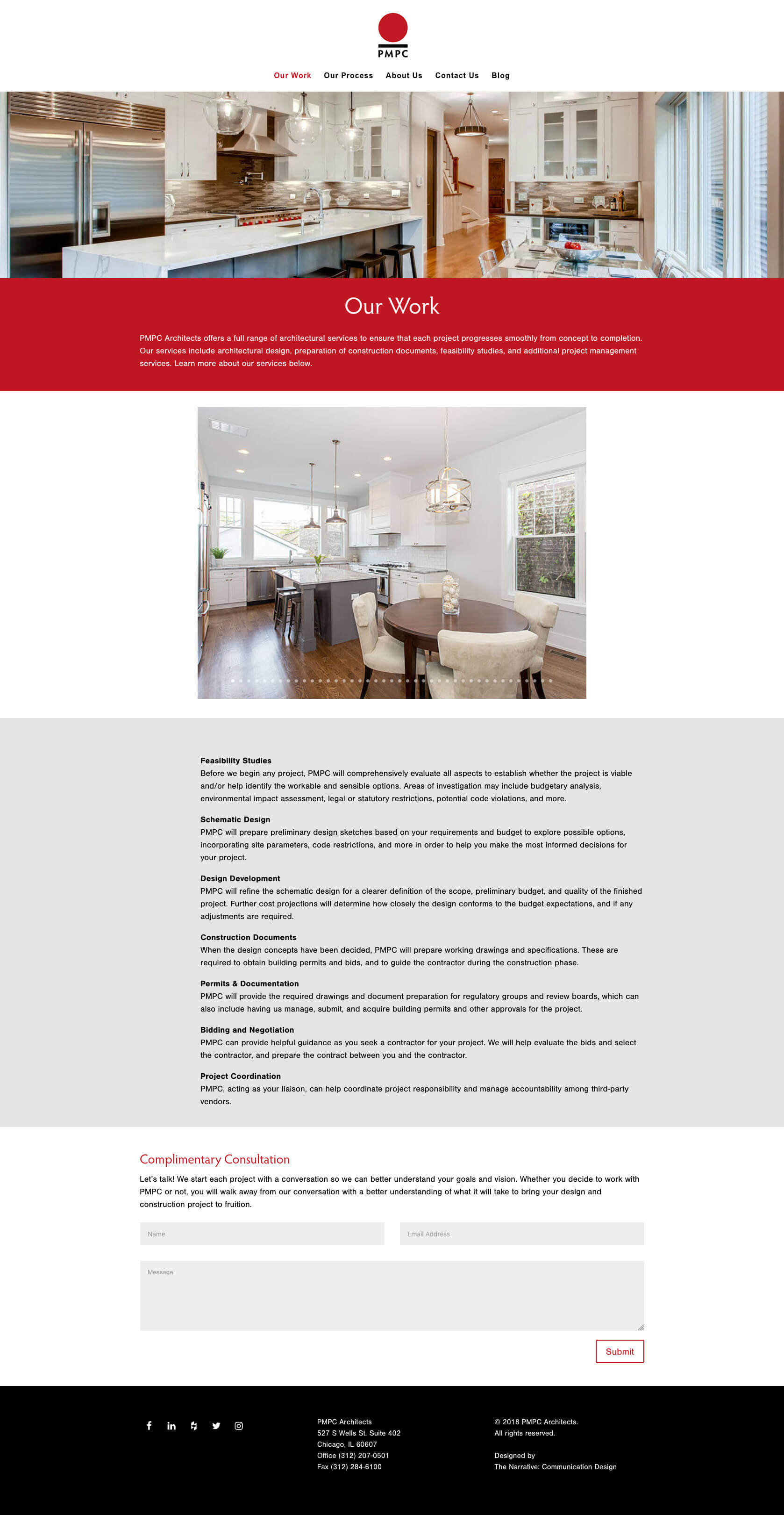
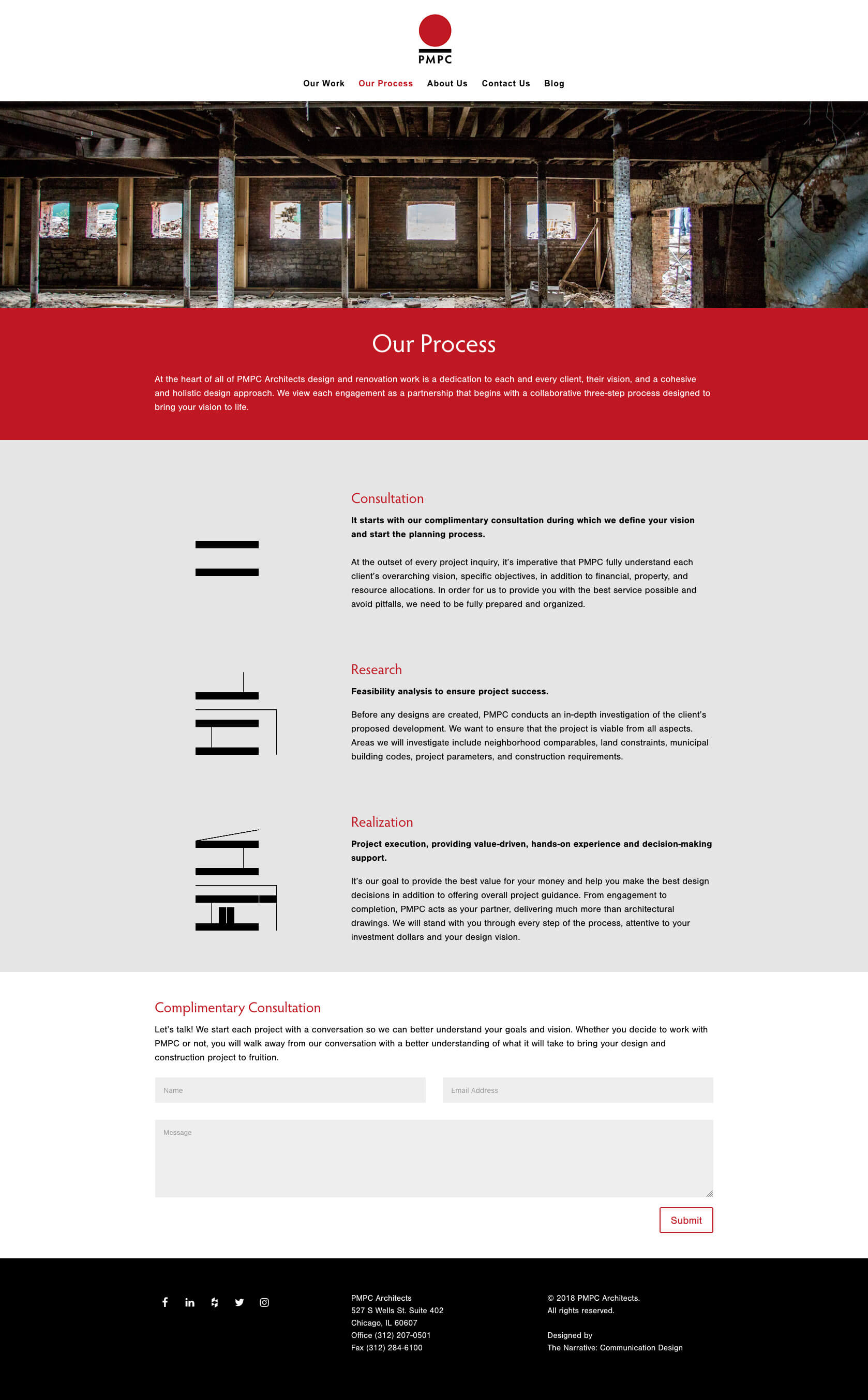
Brand Implementation: Website, Promotional Collateral & Social Media Graphics
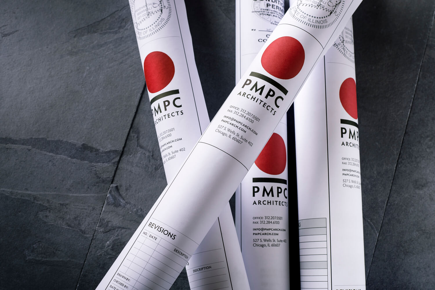
PMPC wanted a new typographic treatment for their existing logo that was contemporary, unique, and that reflects their “Empowerment by Design” philosophy.
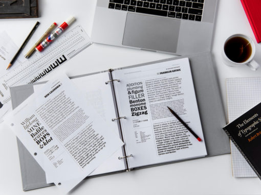
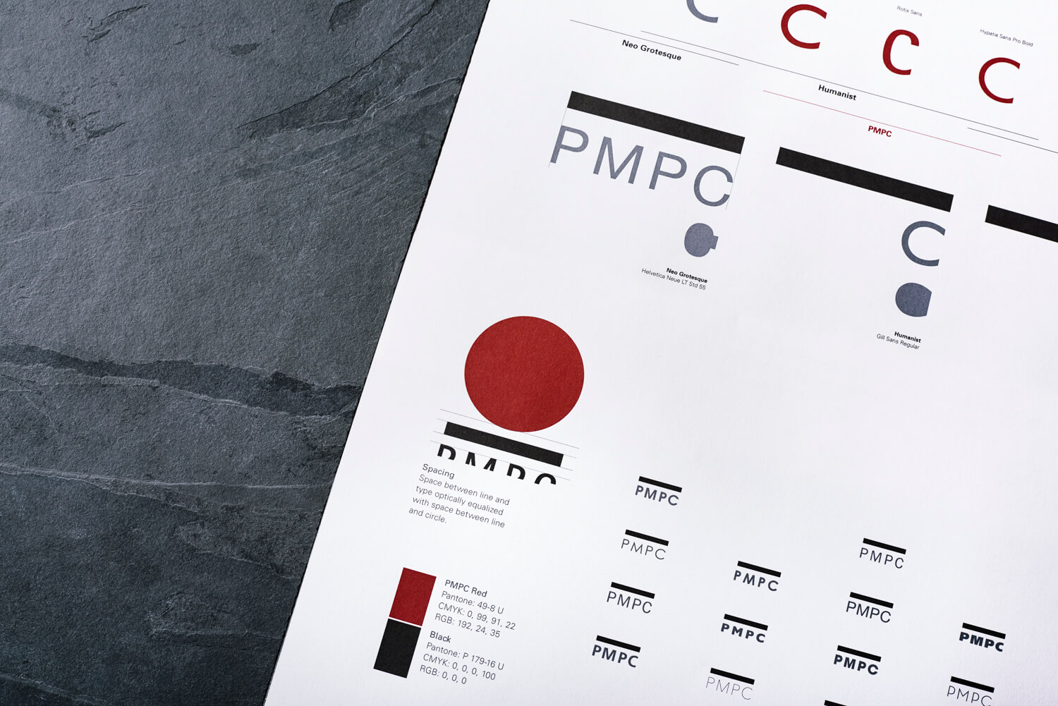
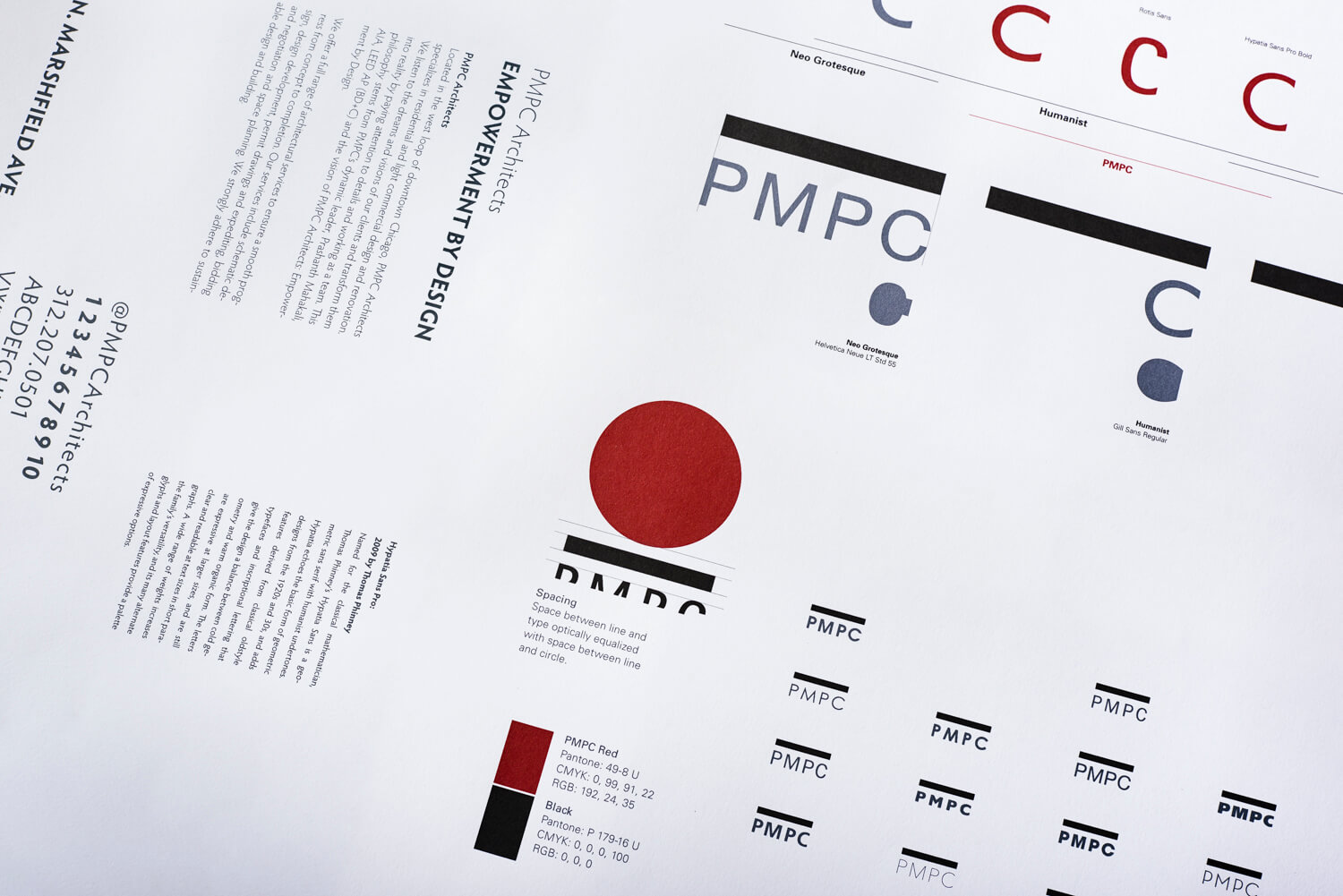
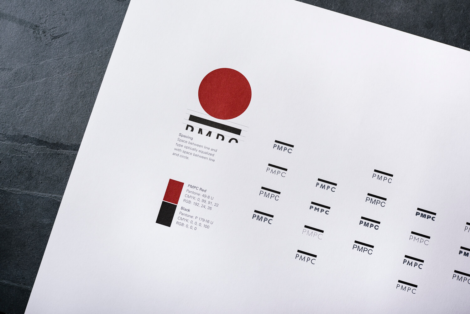
Our first task was to decide on the formal visual relationship between the logo and the letterforms of PMPC. We stacked the letters under the logo to ensure legibility on smaller screens, optically adjusted the existing mark, and began to explore typographic treatments.
PROCESS
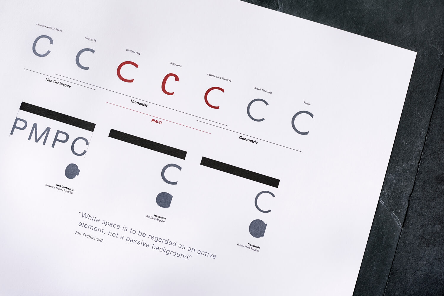
One of the main challenges when stacking the typography under the rectangle of the logo was handling the relationship between the C and the rectangle. When placed underneath the rectangular bar, the capital P continued the line downward (based on the theory of gestalt) that is interrupted on the other side by the counterspace of the capital C. Each potential typeface was typeset to test this interaction.
Our brand research showed that a large majority of the industry uses geometric typefaces, so we sought a typeface that has some geometric qualities but a less mechanical feel.
TYPOGRAPHY
After hundreds of experiments, the final identity uses the typeface Hypatia Sans, a wonderful typeface designed by Thomas Phinney in 2009. This typeface is ideal—it has geometric characteristics with a more humanist feel that embodies the PMPC philosophy of “Empowerment by Design”.
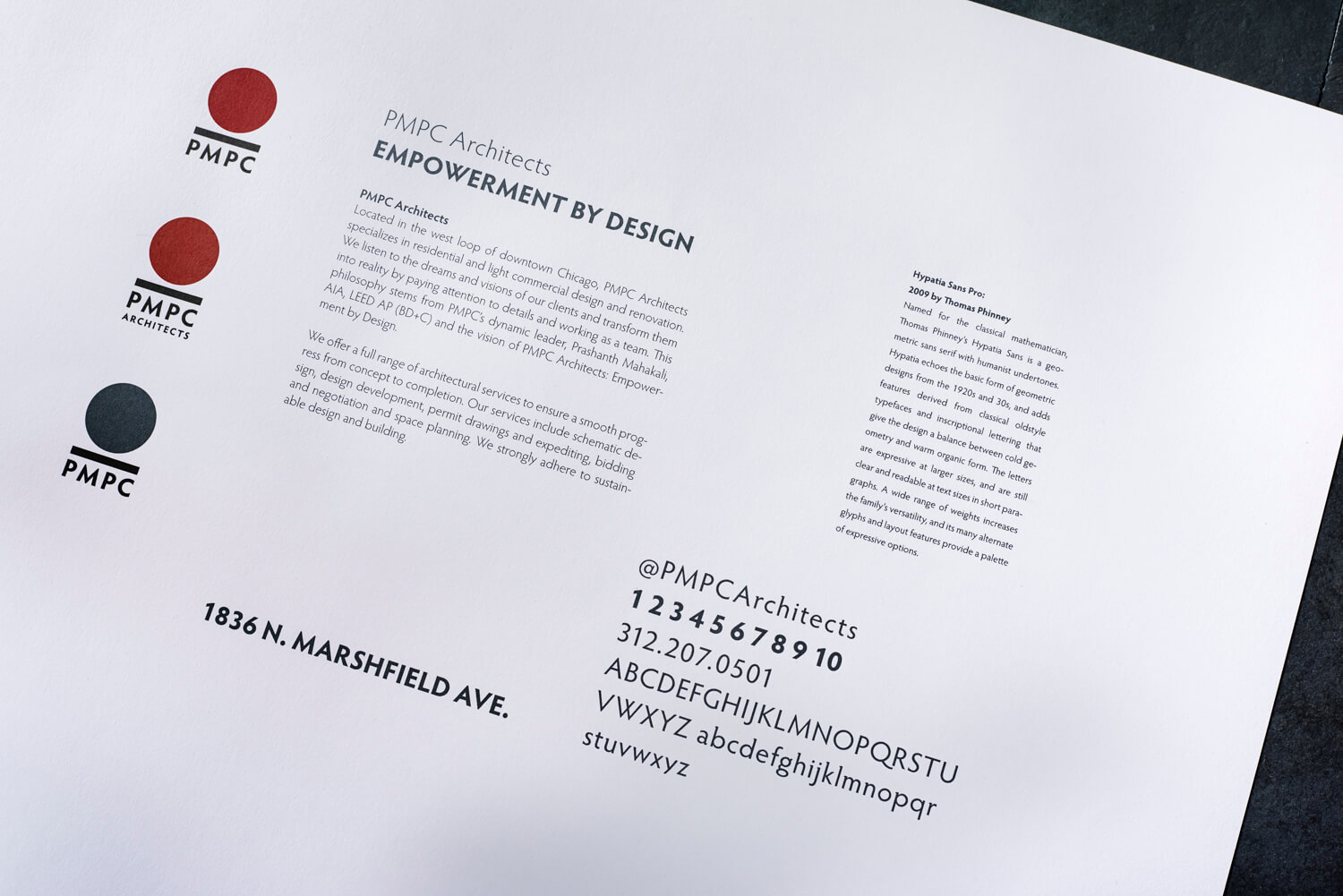
BRAND IMPLEMENTATION
VIEW OTHER WORK